Kitchen cabinet colours shape the atmosphere of a room more than almost any other finish. They cover a large visual area, sit alongside worktops and flooring, and influence how natural light moves through the space. In a London home—where kitchens can range from compact Victorian extensions to generous open-plan renovations—the right palette should feel considered, practical and personal rather than simply fashionable.
The most successful schemes balance character with longevity. Instead of choosing a colour because it is everywhere this season, consider the architecture, daylight, materials and way the kitchen will be used every day.
Start with the light in your kitchen
Before choosing a cabinet colour, observe the room at different times of day. North-facing kitchens often receive cooler, softer light, which can make crisp whites and blue-greys feel sharper. Warm off-whites, putty tones and muted greens can help create a more welcoming impression. South-facing rooms usually enjoy stronger daylight, giving deeper colours such as olive, ink blue or charcoal more room to breathe.
Artificial lighting matters too. Warm lighting can make cream and beige finishes look richer, while cooler lighting may emphasise grey undertones. Ask to see large samples in the actual room and check them in daylight and after dark before making a final decision.
Choose a neutral that has depth
White remains a dependable option, but not all whites are alike. A bright, cool white can create a clean contemporary look, while a warmer white may sit more comfortably with oak floors, brass details and natural stone. Greige, mushroom and soft taupe offer an alternative for homeowners who want a restrained palette with a little more warmth.
Pay attention to undertones. Place cabinet samples beside the proposed worktop, wall paint and flooring. A colour that looks neutral on its own may appear pink, yellow or green when placed next to another finish. Comparing the full palette together is more reliable than selecting each element separately.
Use green and blue with intention
Muted greens—from sage to deep olive—work particularly well with timber, limestone and brushed metal. They bring colour into the room without overwhelming it, making them useful for both classic Shaker cabinetry and streamlined modern designs. Deep blue can feel elegant on an island or a run of tall units, especially when balanced with pale walls and natural textures.
If you are unsure about committing to a strong colour across the whole kitchen, use it selectively. A contrasting island, pantry or dresser can add personality while allowing the main cabinetry to remain calm. The contrast should feel deliberate: repeat the accent in a small detail such as a pendant, stool or accessory rather than introducing too many competing colours.
Let materials guide the palette
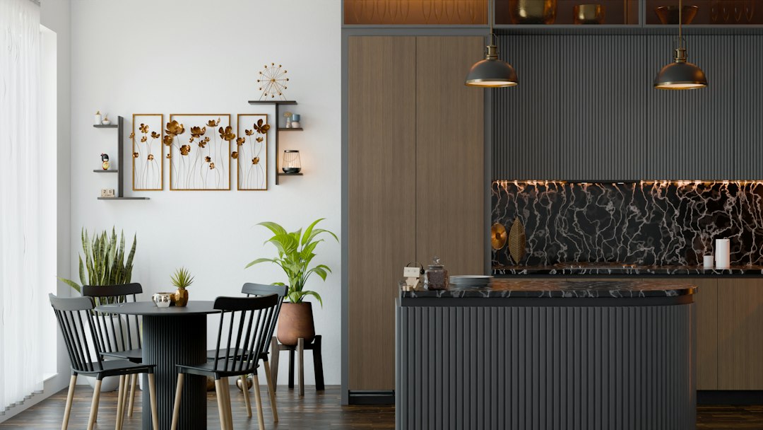
Cabinet colour should complement the materials around it. Warm oak and walnut tend to pair naturally with creamy neutrals, earthy greens and muted stone shades. Cool white marble may suit softer greys or a crisp contemporary palette, while richly veined or warmly toned stone can become the centrepiece when the cabinetry is quieter.
Metal finishes also affect the overall mood. Brushed brass and bronze add warmth, stainless steel feels more understated and contemporary, and black details create sharper definition. Samples of handles, taps and worktops should be reviewed together with the cabinet finish to avoid small undertone clashes.
Consider finish as well as colour
The same colour can look very different in a matt, satin or gloss finish. Matt cabinetry often creates a soft, understated appearance and can help a scheme feel relaxed. Satin finishes reflect a little more light and are often straightforward to maintain. Gloss can brighten a darker room, although reflections may make surface marks more noticeable depending on the product.
Ask the kitchen supplier about cleaning guidance, resistance to fingerprints and how the finish performs under everyday use. A beautiful colour is only a good long-term choice if it suits the household’s routine.
Think about the whole room, not just the doors
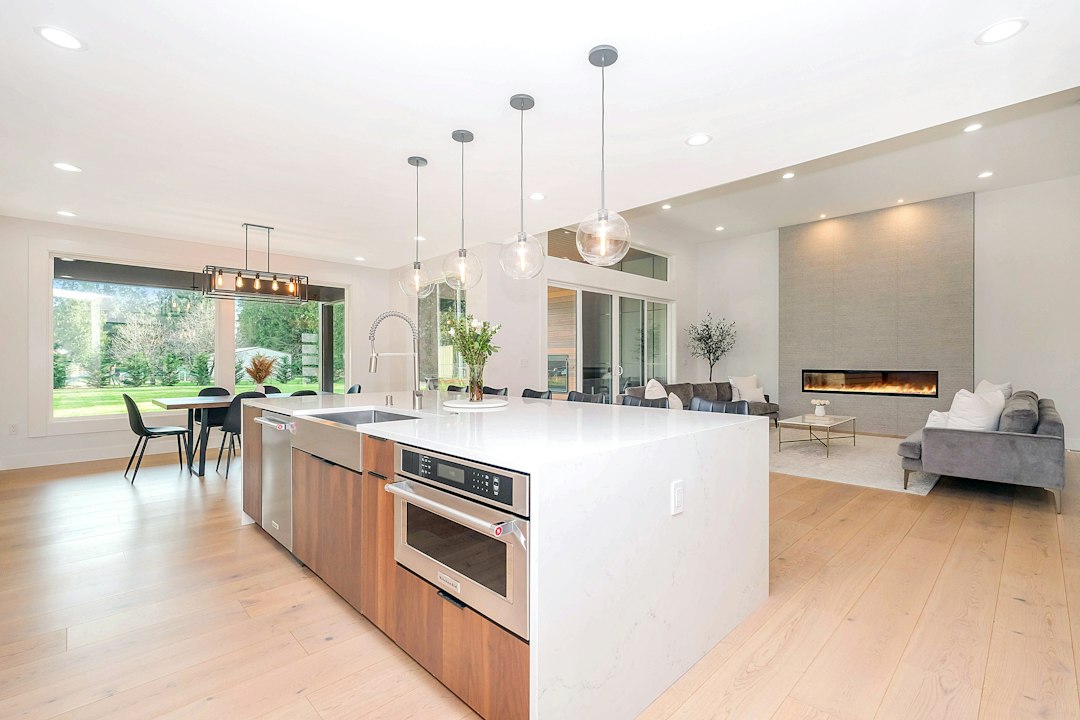
Cabinetry rarely exists in isolation. Flooring, wall colour, worktops, splashbacks, window frames and lighting all contribute to the final result. In a smaller kitchen, a consistent palette can help the room feel more open. In a larger open-plan space, a subtle change between perimeter cabinets and an island can define zones without needing a physical divider.
For period properties, consider whether the palette complements original features such as timber floors, cornices or exposed brick. In contemporary extensions, cabinetry can connect the kitchen to the living area through repeated tones and materials. The aim is not to follow a fixed rule, but to make the kitchen feel like part of the home.
Test samples before committing
Paint chips and small digital images are useful for narrowing the options, but they cannot show the full effect of a large cabinet run. Request larger samples or a door sample where possible. View it vertically, place it next to the worktop and flooring, and move it around the room to see how the light changes its appearance.
It is also worth considering how the palette will age. Very distinctive colours can be rewarding when they genuinely reflect your taste, but if you expect to keep the kitchen for many years, you may prefer to introduce trend-led shades through paint, seating or accessories that are easier to change.
A timeless palette is personal and balanced
The best luxury kitchen colour scheme is not necessarily the palest or safest option. It is the one that works with the architecture, feels right in the available light and supports the way you live. Start with the permanent materials, choose cabinet colours that complement them, and test the complete combination before ordering.
With a thoughtful palette, quality materials and carefully considered lighting, kitchen cabinetry can feel distinctive today and remain satisfying for years to come.